
Golpek®
Logo and packaging range design for a wafer manufacturer
Context
GolPek is a Ukrainian manufacturer of semi-finished wafer products and confectionery based in Lutsk.
The company’s story began in 2001 with a single wafer-making machine. Since then, a small production business has grown into one of Ukraine’s leading wafer manufacturers, with GolPek products entering the markets of Poland, Türkiye, Moldova, and the Baltic countries.
The company was preparing to launch a new range of packaged coated and uncoated wafers. A high-quality product needed a distinctive image that would help it stand out on the shelf and reflect the scale of the business.
The challenge
We needed to create a cohesive packaging range for different types, sizes, and flavors of wafers.
The new design had to help the products stand out from competitors, make it easier for customers to choose between flavors, and keep the brand recognizable across every format.
Updating the logo was another important part of the project. It needed to complement the new packaging and create a more contemporary and cohesive image for the company.

Approach
Before starting the design process, we analyzed the category, the competitive landscape, and the target audience.
The main goal was to find a visual principle that would make the new products noticeable on the shelf while bringing a wide variety of flavors and formats together in one clear system.
Logo
The previous logo no longer felt current or reflected the scale of the company. The Cyrillic wordmark, chef’s hat, gradient, outlines, and other decorative elements created visual noise and made the logo more difficult to use on packaging.
We changed the name to Latin script and created a new custom GolPek wordmark — distinctive, dynamic, and highly legible. The Latin version better reflected the company’s presence in export markets and made the name more suitable for international communication.
We removed the chef’s hat, gradient, unnecessary outlines, and other decorative details. The oval shape was retained as a recognizable element. As a result, the logo became cleaner, worked more effectively on packaging, and remained legible at different sizes.
Below is the GolPek logo before and after the redesign.

Packaging range
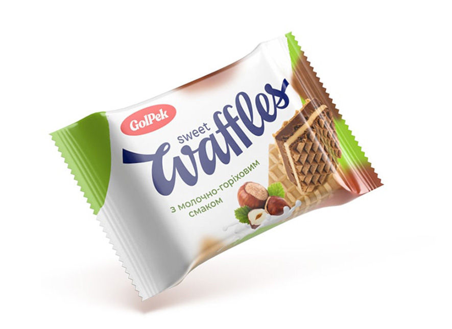
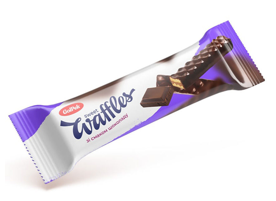
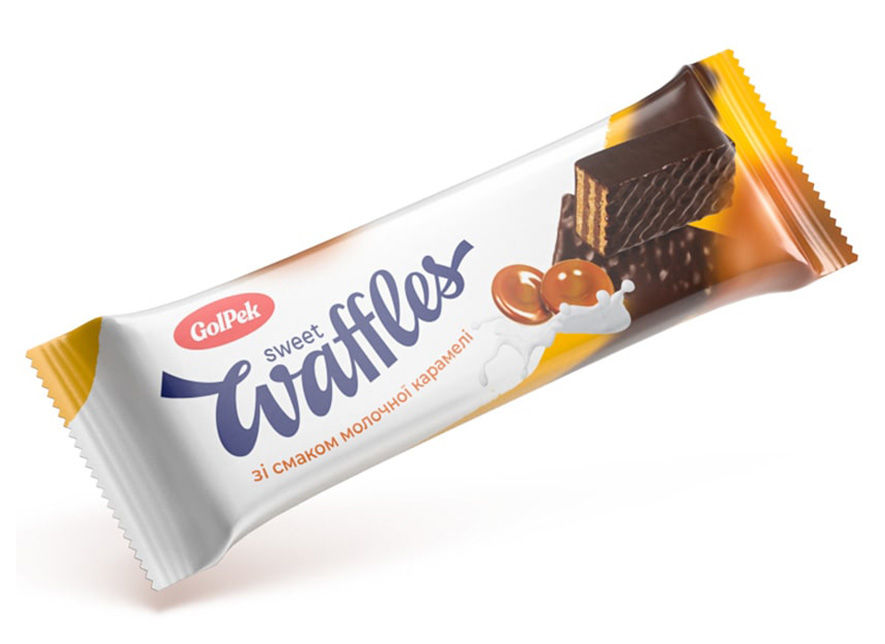
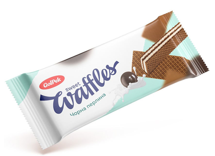
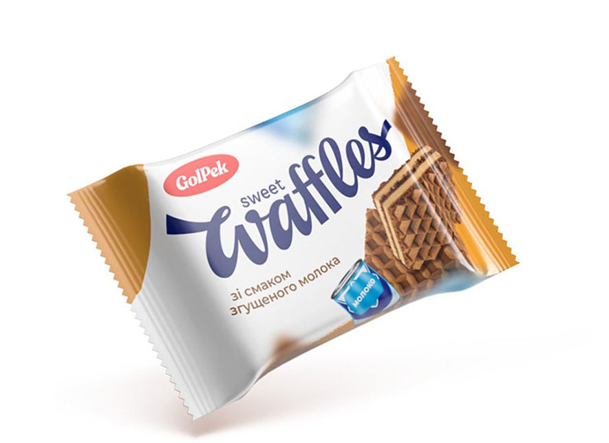
White became the foundation of the packaging design. It helped GolPek stand out from its competitors and created a clean background for the product imagery and flavor accents.
Dynamic compositions featuring wafers and ingredients conveyed a sense of lightness and movement. Bright color accents gave the range a lively and friendly character.
We created a distinct color code for each flavor. This makes it easy for customers to tell the products apart while keeping the entire range visually cohesive.
In total, we developed four packaging categories for different types, sizes, and flavors of wafers. A consistent compositional structure allowed the design to adapt to each format without losing brand recognition.









The result
The updated logo and packaging range created a cohesive image for GolPek that reflected the scale of the company and helped its new products stand out on the shelf.
The white background distinguished the range from its competitors, while the color coding helped customers navigate the different flavors quickly. At the same time, the various categories and formats were clearly perceived as part of one brand.
Created in 2019, the design is still on shelves today. Seven years later, it remains relevant and continues to fulfill its main business purpose: helping customers notice the product, distinguish between flavors, and make their choice with ease.
** Created by Mirrolab in 2019
