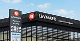
Levmark®
Rebranding and a brand communication system for a regional grocery store chain
Context
Levmark already had a name, a network of stores and an existing customer base. However, it was still largely perceived as a discounter — a perception reinforced by outdated signage, inconsistent communication and the brand’s overall visual presence.
At the same time, the business itself was already changing. New stores were opening in a more contemporary format, with a different product range, a more premium price range, coffee and food prepared in-store. Existing stores were gradually being refurbished.
Inside, Levmark was already offering a new experience. From the outside and in its communication, however, it still looked much as it had before. This created a gap between what the stores had become and how people perceived the brand. The previous identity also lacked cohesion: different signs and typefaces were used across locations, while the existing mascot — a ground squirrel — had no real connection to the name Levmark.
The task was not simply to update the logo. We needed to define the brand’s character and create a system that reflected the new format and worked day to day — across storefronts, price tags, campaign materials, social media and in-store communication.

The challenge
Our goal was to change how Levmark was perceived: to move it away from the image of a discounter and reposition it as a modern grocery retailer.
The new visual identity had to reflect the changes already taking place inside the stores, communicate the quality of the new format and help the brand appeal to a broader, more contemporary audience.
At the same time, we wanted Levmark to feel more approachable and to give it a character and voice of its own.
The system also had to remain easy to use. In retail, an identity does not live only in a brand book — it appears every day in new promotions, offers, price tags and messages, often needed the same day.
That is why we focused not on a complex set of rules, but on a clear foundation that could be scaled easily and used in day-to-day work.
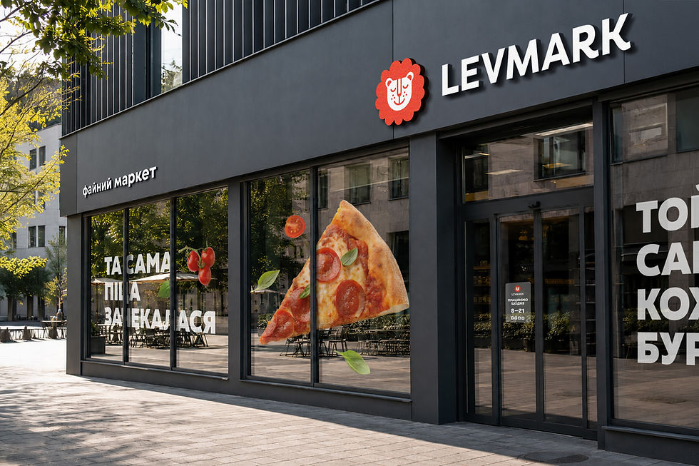
We wanted Levmark to feel closer to people and give the brand a voice of its own.
At the same time, the system had to stay easy to use. In retail, a visual identity does not live only in brand guidelines. It shows up every day in new promotions, offers, price tags, and messages — often needed that same day.
So instead of creating a long list of complicated rules, we built a clear foundation that could scale easily and work in everyday use.

The idea
The answer was already in the name.
In Ukrainian, lev means lion. So Levmark naturally became Mark the lion — and that is how the brand got its own character: a happy lion who clearly enjoys life.
Mark is not a stern king of the jungle. He is relaxed, content, and quietly confident.
A simple idea? Yes. And that is exactly why it sticks — and why it connects so naturally to the brand name.

The Fayno voice
Levmark is based in the Lviv region, so we wanted the brand to sound natural to the people it serves while moving away from the generic language of just another supermarket.
That is how the idea of a fayno market came about.
Fayno is a word you hear all the time in Western Ukraine — warm, casual, and hard to translate exactly. It sits somewhere between “nice,” “good,” and “just right.” It is the kind of word you use when something genuinely feels the way it should.
It became the foundation of the brand’s language and helped connect very different categories: fayno coffee, a fayno burger, a fayno deal.
One rule from the start: use it with care and never overdo it 🙂
Levmark speaks simply, warmly, and directly. It can make a joke and talk to people like someone familiar and easy to trust.
No stiff retail language.

Visual identity
The visual system is built around four key elements: Mark the lion, his mane, a bold, chunky typeface, and a bright color palette.
Mark’s mane became the identity’s most recognizable shape. It can frame a photo, hold a price or a line of text, work as a decorative element, or become part of an illustration. One simple shape with many practical uses.

The symbol also works independently of the wordmark. It can stand on its own, become part of a phrase, replace a letter, or simply anchor the layout.

The system in action
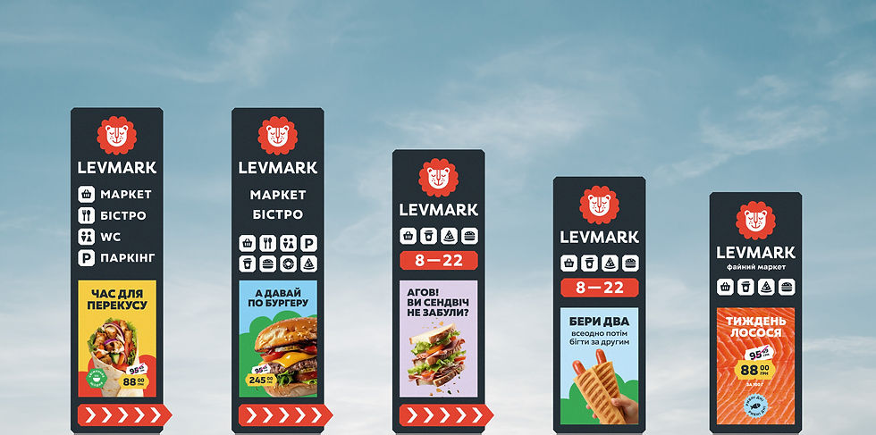
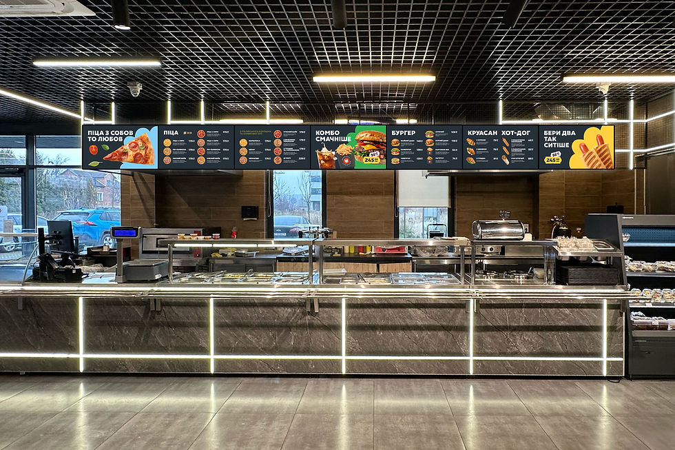
For Levmark, we created a set of custom icons, price tag styles, design principles for promotional layouts, and storefront signage.
Every format is built around the same essentials: a clear message, a strong product focus, bold color contrast, and the recognizable mascot.
The system is not built around rigid restrictions. It relies on core elements, clear logic, and common sense.
That makes the identity easy to adapt across formats and simple for the team to use every day.






The result
After the rebrand, Levmark’s image finally reflected its new format — more modern, more cohesive and more confident.
The updated identity helped move the brand away from being seen as a discounter. Storefronts became more noticeable, communication more consistent, and the overall brand image began to match the stores themselves, their product range and the new experience they offered.
Levchyk made the brand feel lively, human and recognisable. Faino brought a sense of local warmth to its communication, while the flexible visual system made it easy to carry the idea consistently across different touchpoints.
Levmark can now be recognised by Levchyk, his mane, the colours and the tone of voice — even without the logo. The brand now feels more modern and more premium, but no less approachable. On the contrary, it has found a character and voice of its own, along with a natural way to stay close to people in its everyday communication.
Levmark’s new format finally has the brand image it had been missing: distinctive, cohesive and genuinely “faino”.
** Project completed in 2026
