
Dubok®
Rebranding a Furniture Retail Chain
Context
Dybok is a Ukrainian retailer offering furniture, lighting and home essentials through both physical stores and an online shop.
By the time we joined the project, the company had been on the market for many years, had built a broad customer base and enjoyed strong brand recognition. However, its visual identity had become outdated. It no longer reflected the scale of the business or the direction it was heading.
ABOUT THE NAME
The name Dybok (Дубок) comes from the Ukrainian word for "little oak."
The oak has long been a symbol of strength, reliability and longevity in Ukrainian culture. Using the diminutive form Dybok gives the name a warmer, friendlier and more approachable feel while preserving those associations.
The acorn symbol naturally reinforces this idea, creating a meaningful connection between the name and the visual identity.
Before
This is how Dybok looked before we started working together.

The challenge
Our goal was to understand why people chose Dybok, develop a clear brand strategy, and create an identity that would bring that idea to life across every customer touchpoint.
Research
We didn't just ask people about furniture.
We talked about home, about atmosphere, and about what makes a space truly feel like your own.

The answers were different.
For some, home meant comfort. For others, it was a place to unwind. For some, it reflected who they were.
But when the conversation turned to furniture, almost everyone said the same thing.
People weren't looking for magic. They wanted furniture that simply did its job — well made, practical and easy to buy.
One sentence summed it up perfectly:

"I don't want to think about furniture. I already have enough things to think about."
Maria, 32 years
That insight changed the direction of the project. Dybok didn't need to sell the dream of a perfect home. Its strength was somewhere else.
Strategy
Life already comes with enough difficult decisions. Buying furniture shouldn't be one of them.

People needed a brand that made everyday choices easier rather than more complicated.

That became the foundation of the brand.

No promises to change your life.
No chasing short-lived trends.
No selling an atmosphere instead of a product.
Just furniture that's easy to choose, easy to order and easy to receive.
Communication
That idea became the foundation of the brand's communication.

Not like the picture.
Like the way that feels right for you.
Some things don't need to be complicated.
We want to make life a little simpler in a world full of complexity, noise, and constant demands.
The brand brings this idea to life not only through its communication, but also through its products, service and the everyday shopping experience.

Visual identity
The identity follows the very same principle: don't overcomplicate things.
It is clear, practical and designed to handle large amounts of information with ease. That was essential for a retailer communicating thousands of products, categories and promotions every day.



Logo
One important decision was to move from the Latin spelling to the Ukrainian Cyrillic wordmark, making the brand feel more authentic and approachable for its audience.
We also designed a new custom lettering — modern, geometric and highly legible — and refined the acorn symbol, making it simpler and more minimal.

Together, they form a logo that feels confident, easy to read and true to the brand's character.


Visual system
Simplicity became the guiding principle not only for the communication, but for the entire design system.
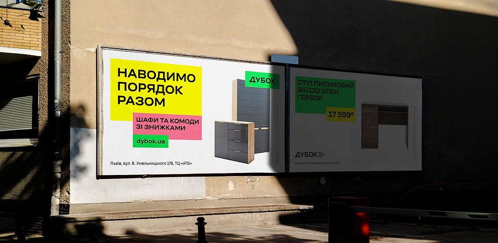
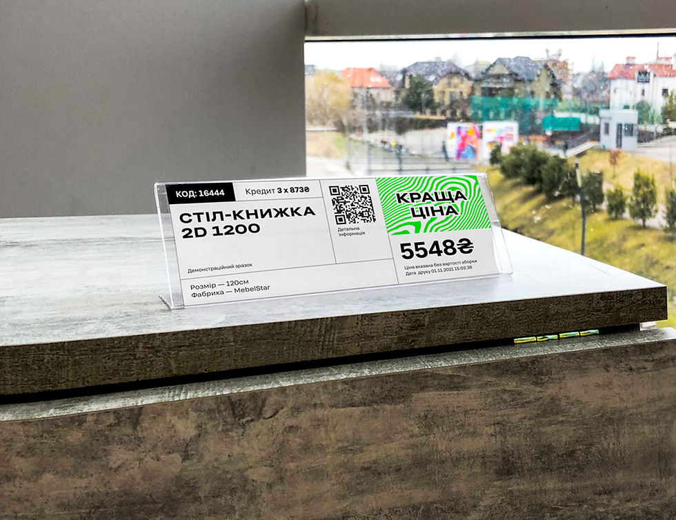
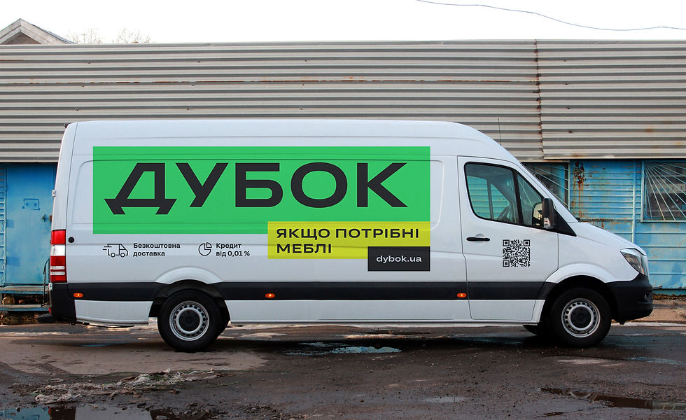
We deliberately built it to adapt quickly and effortlessly to every format — from social media and advertising to in-store communication.
The system is based on a small set of clear, practical rules for typography, colour, graphic elements and layout.
This allows new materials to be created quickly without sacrificing consistency or brand recognition.
Just like Dybok's core idea, the system is simple, practical and easy to work with every day.






The result
After the rebrand, Dybok finally looked like the business it had become.
The new identity gave the brand a stronger and more confident presence across both digital and physical touchpoints. The stores became easier to recognise, and every piece of communication finally started speaking the same visual language.
The brand also found a clearer, more human voice. Instead of disconnected messages, it gained one central idea that could guide advertising, customer communication and the overall shopping experience.
Dybok became more visible, more consistent and free from unnecessary visual noise. Simply a brand that's easy to turn to when you need furniture.
** Project completed in 2022

